So what do the Mayan calendar and the Fiscal Cliff have in common? Perhaps nothing more than counting down the end of days for the world or allowing taxes as we know them to increase. There's certainly no shortage of information in the media, and it seems hard to avoid talking about these "events" with our students.
The presidential election was no sooner over in November than we started heading for the precipice. Judging from the current state of affairs in Washington, we just might fall.
Nevertheless, we are always looking for ways to keep our students engaged as we approach the holiday break, and there are plenty of dynamic infographics available. Here are some of our favorites that we've shared with our students, and as always, they can be used in a variety of disciplines.
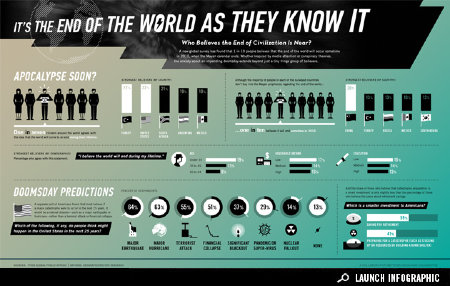
It's the End of the World As They Know It from
Good.is has some interesting statistics regarding countries that believe the apocalypse is coming and the dire predictions of how it will happen. Another is the visualization called
Countdown To 2012 from
KarBel Multimedia. This design shows the ticking away to the end as gears inside a clock. There are others, such as the
End of the World or the believers and skeptics
infographic, which parallels the views from both sides about the prophecy, celestial significance, cataclysm, and consciousness shift.
As for Fiscal Cliff infographics, there are plenty that do a nice job of showing the two sides of the issue, both on the tax increases as well as on the political points of view. Any of these visualizations make for great discussions about economics, finance, and politics. It's hard not to see how they would fit into any social studies class.
One particularly interesting visual is
The Fiscal Cliff - 2013 - Cheat Sheet by
Demon-Ocracy Info that uses mounds of $100 dollar bills to illustrate the financial situation. It also produced the following powerful, animated video using the same concept of using $100 dollar bills to visualize debt in the United States.
A few others include the infographic from
ABC News, incorporating the red and blue color scheme to highlight the political affiliation, and
The Fiscal Cliff: What Does It Really Mean?, showing a different representation of the information.
In all of these designs, it's important to carefully dissect the details. One of the things we do with our students whenever we use visualizations is to
compare the data and information for discrepancies.
A key component in our curriculum is
media literacy, and it's important always to include the core concepts of media literacy whenever students are
looking at infographics to check for possible biases or misinformation.
In addition, we continually want to reinforce the skills of
graphicacy to build our students' abilities to be
visually literate and to be visual thinkers. So much of what they see depends on a solid foundation in these areas.




 The Long Island Rail Road (LIRR) is the busiest commuter train in the country. Each day, the Manhattan Transit Authority (MTA) carries 335,0...
 (This is Part One in a two-part series about the expectations of learning relationships. Please check out Part Two : " 5 Things Learne...
 Source: The Forest Even though we don't teach science , we find ourselves returning again and again to motion graphics that tell storie...
 Source: Business Pundit Most students think of Labor Day as the end of the summer vacation, even if some kids start school before the offic...
 Source: Capstone Publishing The Fact Finder book series by Capstone Publishing helped us design one of our signature TIME (technology, in...
 Source: Vision of Humanity If we ask the question, “Which has more of an impact on society, peace or conflict, greed or giving, or hope or...
 Source: ASIDE Is creativity an end, or a means to an end? In education, this question has no easy answer. At times, creativity serves as a v...
 September is the schoolest month. After a summer of distractions, we reenter the merry hubbub of kids and classes, parents and planning. Th...
 Media literacy is learning how to analyze and interpret media messages by questioning what you listen to, see, watch, or read, from paper to...
 (This is Part Two in a two-part series about the expectations of learning relationships. Please check our previous post in Part One : ...