


 |
| Source: Good.is |
 |
| Source: KarBel Multimedia |
Nevertheless, we are always looking for ways to keep our students engaged as we approach the holiday break, and there are plenty of dynamic infographics available. Here are some of our favorites that we've shared with our students, and as always, they can be used in a variety of disciplines.
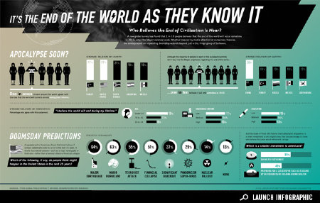
It's the End of the World As They Know It from Good.is has some interesting statistics regarding countries that believe the apocalypse is coming and the dire predictions of how it will happen. Another is the visualization called Countdown To 2012 from KarBel Multimedia. This design shows the ticking away to the end as gears inside a clock. There are others, such as the End of the World or the believers and skeptics infographic, which parallels the views from both sides about the prophecy, celestial significance, cataclysm, and consciousness shift.
 |
| Source: Demon-Ocracy Info (detail) |
One particularly interesting visual is The Fiscal Cliff - 2013 - Cheat Sheet by Demon-Ocracy Info that uses mounds of $100 dollar bills to illustrate the financial situation. It also produced the following powerful, animated video using the same concept of using $100 dollar bills to visualize debt in the United States.
A few others include the infographic from ABC News, incorporating the red and blue color scheme to highlight the political affiliation, and The Fiscal Cliff: What Does It Really Mean?, showing a different representation of the information.
 |
| Source: ABC News |
A key component in our curriculum is media literacy, and it's important always to include the core concepts of media literacy whenever students are looking at infographics to check for possible biases or misinformation.
 |
| Source: Colorlines (detail) |


