Showing posts with label chart. Show all posts

The School Of Big Data - Choosing The Right Graph


Big Data Analytics - Choosing the Right Chart for Your Data from Datameer on Vimeo.

We've enjoyed incorporating charts and graphs into our weekly lessons. The best thing about data displays is that they evoke numerical stories within any discipline, whether science, math, economics, history, or humanities. Understanding a graph is an essential skill. Creating an original chart, however, is a higher-level exercise. It is the difference between decoding a political cartoon and creating an original drawing. It's the difference between reading an essay and writing an essay.

The clear, detailed video from Datameer (above) lays out six essential types of charts and gives numerous examples of their potential applications. Even though Datameer is a data management company, the engaging video is ideal for teachers and learners. The clip offers a step-by-step primer about the range of visual options for all sets of numbers and statistics.

Source: Extreme Presentation
The ever-expanding world of "Big Data" means that our students must emerge from high school with a deft familiarity in numbers and analytics. To read more about how databases and statistics are shaping the field of education, you might check out the following:
A useful site to use in the classroom is the Chart Chooser from Juice Analytics. The roster of resources gives targeted tools for all sorts of data goals. It pairs well with the Chart Chooser diagram from Extreme Presentation. The handy graphic provides an instructional flowchart to select the best chart or graph for a range of desired outcomes.

Source: Juice Analytics
Accurate graphs can enhance classroom conversations about current trends or data sciences. Poorly constructed charts, however, can distort meanings and impart imprecise interpretations. The reliability of graphs, in fact, became a debate point in the 2012 presidential election. 

For further reading about creating graphs, we recommend:
For eye-opening examples of "bad" charts, we recommend:

Posted in , , , |

I Love Charts - Discovering Stories Hidden In Numbers

Source: 8th Grade Student, ASIDE
This week, we are teaching our students how to create charts. On a higher level, we are also helping them realize the benefits of graphs in discovering stories hidden within data and in demonstrating opinions through visualizations.

Guiding kids to decode illustrated data can result in a life-long skill, vital for their future budgets and 401ks. But freeing them to make graphs on their own can also unlock the perceived mysteries behind scientific displays. Whether digital or paper-based, student-designed charts can be great cross-curricular tie-ins between social studies and math, good for any grade level. Elementary learners can create pie graphs to show fractions. Middle school algebraists can practice their slopes and x/y intercepts. High school economists can plot variable cost curves and production possibility frontiers.

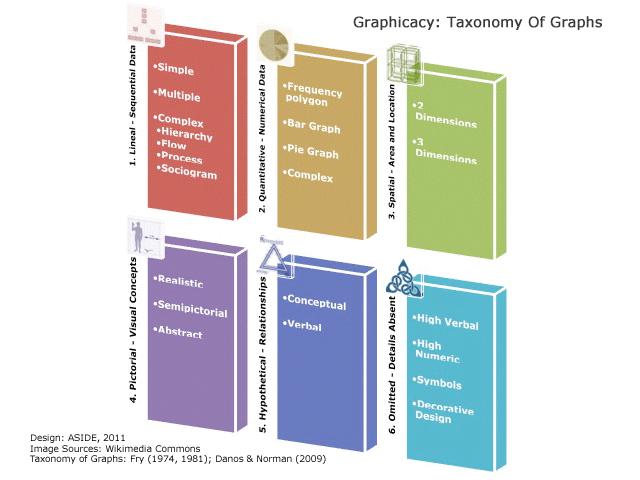
In teaching about primary source data and Excel models, we like to incorporate the "Taxonomy Of Graphs" as a visual guide to the different types of displays, from the literal to the abstract. We also like to let children explore the many online sites for quick graphic generation.


A terrific video to make kids smile and introduce the broad world of graphs comes from Sid The Science Kid on PBS Kids. The catchy musical clip, entitled "I Love Charts," has been shared by several sites thanks to its catchy jingle and educational value.

Source: 8th Grade Student, ASIDE
As an example of an in-class lesson, we did a quick one-day exercise with our eighth-graders to explore the regional changes in agriculture and farming after the Civil War. Using data from the PBS American Experience site, "Reconstruction: The Second Civil War," our students produced graphs of each state to reveal transformations in the number and value of both land and manufactured goods. Even while cataloging numbers and formatting line graphs, the students were thoroughly engaged, tweaking their layouts and choosing colors and designs. They also added hyperlinks to their images so classmates could click directly to the source.

Source: History Tech, 8th Grade Student, ASIDE
Another trouble-free lesson in chart creation comes from Glenn at History Tech. We followed the excellent suggestions in his blog post and invited our students to debate in small groups the relative weight of three Civil War causes. They discussed for several minutes and then made simple pie graphs on the free online tool Pie Color. Finally, each team displayed their graph on the SMARTboard, justifying their percentages to the rest of the class.

Some of our favorite sources for statistical data to use with students include:

Posted in , , |

A Controversy Of Graphic Proportions

We use a lot of charts and graphs in our classes, to assess the changing world and to develop skills of visual analysis. Teaching children to decode, create, and apply data visualizations can foster some of the most valuable skills they will need for future use. Our middle-schoolers, for example, use census data to compare pre- and post-Civil War production in farming and manufacturing.

Source: ASIDE
In the past, they have also graphed exports of colonial raw materials and increases in 1800s industrial goods. The NCES Kids Zone and the U.S. Census for Kids both contain terrific resources for elementary and middle school students. On their websites, users can instantly generate graphs with colorful, interactive tools. One of our other favorite sources of facts and figures is the six-volume Almanac of American Life, which covers virtually every statistical topic of United States history.

Newspapers and magazine rely on graphs to depict current news stories, and political candidates often offer charts to buttress their positions. Republican hopeful Mitt Romney, for example, recently faced media scrutiny over a key graph in his jobs plan. Some commentators complained that the graph was intentionally misleading in assigning blame for the recent recession. A careful examination of the text within the image and within the supporting paragraphs, however, does accurately explain the representation, but an observer needs a honed critical lens to parse the graph properly.

Source: Romney for President
Another primary contender, Michele Bachmann, prominently used charts in a January televised speech rebutting the president's State of the Union address. She, too, received criticism over selective use of data, leading to a virtual graph war over which was the most truthful economic depiction.

The most renowned and effective political wielder of statistical charts, of course, was 1992 independent candidate Ross Perot. His intensive use of graphs during his paid television segments convincingly made the case for deficit reduction and spending changes. It was a far cry from the typical bluster and voice-overs of most campaign ads, and for 18.9% of voters, it was a welcome change.
Source: YouTube
Legendary NBC newsman Tim Russert also famously used simple whiteboard numbers to explain the complexity of the Electoral College during the 2000 presidential race. His straightforward eloquence and genuine decency made his one of the most respected voices in political punditry.

Check out our other posts about design and education in the 2012 election.

Posted in , , , |

A Taxonomy Of Graphs

In order to learn the skills of visual literacy, students can practice how to “read” an image. To do this, they need a “language” to understand the different types of graphic tools.

Just as students move up in grade levels, enjoy more complex literature, and solve harder math problems, they also steadily encounter more advanced graphic representations. The skill of graphicacy incorporates clear methods and tools, just as linguistics and mathematics have their own terms and structures.

In their work, “The Development Of A New Taxonomy For Graphicacy” (2009), Xenia Danos and E.W.L. Norman draw upon the work of Edward Fry to offer a new series of classifications for pictorial devices. The authors help teachers introduce graphicacy into their curricula by defining the categories of visual analytics.

For example, in the “Taxonomy of Graphs” (Figure 8), Danos groups different types of displays based on Fry’s descriptions (“Graphical Literacy,” Journal of Reading, February 1981). In the taxonomy, the visual tools become increasingly complex, moving from literal to abstract:

  1. Lineal graphs show sequential data, such as story lines, timelines, flow charts, sports playoff brackets, or genealogy charts
  2. Quantitative graphs display numerical data, such as line graphs, bar or pie charts, or supply and demand curves
  3. Spatial graphs reveal area and location, such as floor plans, road maps, or contour renderings
  4. Pictorial graphs rely on visual concepts, such as realistic paintings, cartoons, or abstract drawings
  5. Hypothetical graphs address the interrelationship of ideas, such as theoretical models or sentence diagrams
  6. Omitted graphs intentionally leave out explanatory details, such as essay outlines, corporate logos, statistical tables, religious symbols, or decorative designs
These vocabularies help teachers describe the steps of visual interpretation to our students. By using a common terminology and understanding which graphs are more or less approachable, we can better help our students use these tools. We can differentiate for each student the appropriate level in graphicacy, just as we level books into reading baskets and move systematically from pre-algebra to algebra to algebra II.

Posted in , , , |

Search

Swedish Greys - a WordPress theme from Nordic Themepark. Converted by LiteThemes.com.