Archive for 2013

Social Engineering: A Lesson In Digital Citizenship

Source: Cybercrime Review (detail)
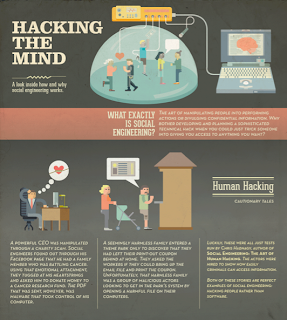
If you’re like us, the term “social engineering” may not have entered your tool kit for teaching digital citizenship. According to Wikipedia, it is the psychological manipulation to get people to divulge confidential information by building a sense of trust. In the current digital environment, it is used for the purpose of gathering information or access to data via the Internet.

We’ve heard of phishing, hacking, or just looking over someone’s shoulder, but this approach is much more, as illustrated in the infographic Hacking the Mind from Veracode. Social engineering affects everyone. Perhaps a good way to describe it is human hacking.

Security Search describes it as away to trick people into breaking normal security procedures by gaining the confidence of the user. Our learners are particular vulnerable to this, because social engineering is designed to exploit the natural trust children have of others, to take advantage of their naïveté, or to prey on their weaknesses from not being fully informed.

While we constantly talk to our students to remind them how to protect themselves online, we have never used the term social engineering. For that reason, we began showing them the following Social Engineering motion graphic to help them build an understanding of what it is and to become familiar with the term.


As we’ve mentioned many times before, we find that visualizations help to seal the deal and make the message better understood. Our young learners have a lot to think about in the digital world. Anytime we can give them one more view of how to protect themselves from online scams, the better.

Posted in , , |

Add #Edchat Radio To Your PLN

Source: #Edchat Radio
With the overwhelming number of new technologies, web tools, apps, and curricular demands, it almost seems impossible to keep up with everything. One solution we’ve never looked back on was adding Twitter to our PLN and following the #edchat hashtag.

If you are one of those educators who says, “I don’t have time to tweet,” fret not; there are other ways to follow up on the weekly #edchat conversations. The associated wiki page archives the transcripts from each chat. It’s fairly easy, therefore, to go back and review the exchanges that took place. They won’t disappoint.

Still feeling inundated with not enough time to read the weekly banter? Then check out the #Edchat Radio broadcasts on The Bam! Radio Network. Tom Whitby, co-founder of #edchat, hosts the show with Nancy Blair, an education consultant. The 12-15 minute interviews with educators in the trenches coincide with the topics covered in the weekly chats on Twitter. The casual, roundtable discussions are open, frank, and refreshing. The podcasts are also available as free downloads from the Apple iTunes store.
Source: Bam! Radio
Over the past two years, we have written posts about the importance of Twitter for professional development, and we still stand by that mantra. There are many targeted chats by grade level, discipline, and theme to truly inspire and engage teacher-learners willing to take the plunge. Whether you lurk, participate, read, or listen, take advantage of the free exchange of ideas on social media.

#Edchat takes place every Tuesday at 12:00 noon and 7:00 p.m. (EST). Join the movement! Check out this video produced by co-founder Shelly Terrell.


Other resources about #edchat:

Posted in , , |

Education And E-cology

As we embark on another year as educators, we have a lot to think about with regard to designing new tasks made possibly by technology. We’ve heard and read countless times about how we are educating kids for jobs we don’t know will exist, resulting from technological advances happening at lightening speed, to the point where it seems overwhelming to keep up. And it is not likely to abate any time soon. We are no longer in a world that is changing a certain amount every year. The luxury of a slow, linear, arithmetic approach is gone. Instead, our learners are operating in a world that is changing exponentially.

We recently came across the motion graphic "Trillions," produced by Maya Design for the book Trillions: Thriving In the Emerging Information Ecology by Peter Lucas, Joe Ballay, and Mickey McManus. The video gives an overview of how we arrived where we are in computing today using a time line based on seconds. The authors make the point that designing for trillions is a huge challenge, bigger than any we have ever faced.


Trillions from MAYAnMAYA on Vimeo.


It was the line in the video that “computing is an ecology” and that it is all around us – “not information in the computers, but people in the information” – that made us think: What do we mean by ecology? The standard definition for the word didn’t seem to help, and we wanted a way for our students to get a better grasp of how ecology relates to computing.

This is how we came up with the term e-cology and the subsequent definition: the branch of sociology that deals with the transmission, creation, and design of digital content and its interrelationship with society and the environment.

If we want our learners to have a stake in the developing digital world, we need to consider how we educate them in this new e-cology. We rapidly see the changing face of jobs now, let alone 12 years from now when out current kindergarten students will graduate from high school. New positions for social media, digital asset management, and data visualization are just a few of the employment opportunities that were in their infancy just five years ago.


Startups are also on the rise in many fields, including education. We see the extent of new types of opportunities for educators, and we don’t just mean companies trying to market material for the Common Core. The challenges do seem enormous for our students, but the risk of not facing the need for changing education in our schools is far greater. We need a paradigm shift in curricula now to accommodate the changing e-cology or we will fall further behind as a society of innovators.

Posted in , , , |

Talking To Our Kids About Syria - Visual Resources For Learning

Source: PBS
We’ve only been in school one week, and our students have already been probing about the situation in Syria. It’s dominated their Twitter feeds and topped the news rundown on their carpool radios. We ended up scrapping our lesson on Friday to explore the facts of the Syrian conflict with the students on iPads.

It can be challenging to explain the cultural and revolutionary dynamics in Syria without getting pinned into a “should we or shouldn’t we” intervention choice. At the same time, we found it disconcerting that three different kids in three different classes asked whether the President’s actions toward Syria would lead to World War Three. After a bit of questioning, it turned out they were all responding to a misquoting of remarks by the Syrian deputy foreign minister that had been hyped by cable news.


The syrian conflict, in 5 minutes from BOMBILLO AMARILLO ® on Vimeo.

Luckily, a host of trustworthy visual resources exist to help kids learn about Syria. These can fit into any course subject, from a social history of the tension to the science behind chemical weapons. Students can then make up their own minds regarding U.S. involvement.

The animated video above is the perfect place to start in letting students learn about the history of the conflict. Created by Wilson Liévano and designed by Bombillo Amarillo in association with Animated Press, the motion graphic is informative and age-appropriate. It offers a complete cultural timeline and an explanation of Bashar al-Assad's reactions to rebel resistance.

Source: The New York Times

For lesson plans and teacher tools, PBS lives up to its reputation for objective reporting with a "cheat sheet" of regional facts and a "What Would You Do?" simulation. The news site is an invaluable repository of classroom resources.

Source: Al Jazeera

The New York Times also presents an interactive feature on the "Evolution Of Syria's Conflict." It dates from last year, but it lays out some strong background details on the roots of the war. For infographics about possible partners in a military intervention, Visual.ly has gathered a helpful library of images, including the one above from Al Jazeera.

Source: PBS Newshour

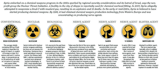
Chemical weapons are bound to come up in conversations with students, because the President drew his "red line" at their use. Kids also worry about their gruesome effects. One approach to this discussion is via science. The diagram above from PBS Newshour outlines technology to survive possible exposure. Richard Johnson at the National Post also offers a detailed graphic that explains the different types of chemical agents that Syria might employ.

Source: National Post (full image)

Finally, refugees fleeing the Syria devastation are perhaps the most critical but least reported story. The video below from Simon Rawles, entitled "Syria's Lost Generation," is a good one to share with students, because it highlights the displacement and suffering of children their own ages and younger.


Syria's Lost Generation? from Simon Rawles on Vimeo.

Posted in , , , , |

Labor Day Animation & Infographics

For many, Labor Day is a sign of the end of summer, the return to school, a three-day weekend, and lots of store sales. For our students, as with many other holidays, it is a day off with no classes. We often wonder how many truly understand the meaning of labor, especially when they complain of too much homework and studying. By definition, labor is hard physical work. It is also the reason we plan this week on showing them this TED-Ed animation, "Why Do Americans and Canadians Celebrate Labor Day?" by Kenneth C. Davis.


As with all TED-Ed animations, educators can use the thinking and discussion questions that are provided to deepen the learning. This particular video not only provides an excellent overview about the holiday, but it also opens up connections to child labor today. Many of our students are sheltered from the idea that this is a major and growing problem around the world. They are also almost a century away from a time period in American history when children had to labor long hours in factories and not attend school. They can't image life any other way than what they know now.

Source: LIN@R
We've also gathered some recently published infographics for additional resource materials on the topic. The first is United States Labor Day 2013. The simple and clear layout of this design makes it easy to use with any age group. Some of the details include median earnings of males and females and the top occupations. We bet most kids today would not even think that farmers made up the largest occupation in 1910 compared to retail salespersons in 2012.

Source: Infographiclist
The other infographic Say Goodbye To Summer - Labor Day 2013 is how most kids think of the holiday. While it provides no history of the day, it does give an overview of how far families travel to celebrate, what they will spend on back-to-school items, and what we have to look forward to in the fall.

For other resources on the topic of labor see:

Posted in , , , |

Learning Environment - The Graphic Nature Of Animation

Source: The Forest
Even though we don't teach science, we find ourselves returning again and again to motion graphics that tell stories about the natural world. Maybe it's because our students' curiosity unfailingly becomes piqued by issues of earth fairness.

Children are the first to recycle and the first to insist on preserving the environment. They feel close to the outdoors, the grass, and the innocence of animals. They haven't yet been converted to the germaphobic paranoia of Purell. For kids, taking care of the earth is not a progressive versus conservative debate. It's a natural reaction to seeing litter in the garden or oil on the pond.

We've collected below a few of the best educational videos about world studies and environmental science. These infographics attest to the power of animation and computer models, as well as the need for coding and design training in our schools. More than anything, they speak to the effectiveness of visual communication over aural or literal.

Earth science courses could obviously make great hay of these clips. But any homeroom or social studies class could show them as Monday morning waker-uppers. They highlight urgent current events and speak to the role of the United States in the global community.

These films also reinforce the tools of graphicacy. They combine statistical data with arresting visual facts. They employ geography, too, in their representations of oceans, continents, and countries.

"The Forest," by Sasha Milic, reveals the impact of deforestation in Indonesia. The clip is stunning in its beauty and its narrative quality. It's a captivating feat of animation and storytelling. On the surface, it highlights a critical issue in a specific country, but more deeply, it offers an invitation to use eye-catching motion graphics in sharing revelations about science and the environment.


The Forest from Sasha Milic on Vimeo.

If teachers want students to create their own animated movies, we like the Easy Studio iPad app for producing quick, cute videos. It's not free, but it offers a host of features and shapes to generate surprisingly fluid clips. Check out this video for a preview of its functions.

If you're skeptical about the nonverbal communication power of graphics, check out the Water Saving Campaign clip posted on YouTube and Video Infographics. The narration is entirely in Arabic, but a viewer of any language can easily understand its message.

Take a look at these other masterful animations about the environment, all available from YouTube, Vimeo, or Video Infographics. They are as much works of art as works of science:

Ending Overfishing


Ending Overfishing from OCEAN2012 on Vimeo.


Bill McKibben's Thought Bubble: The Fight Of Our Time


Bill McKibben's Thought Bubble: The Fight of Our Time from Thought Café on Vimeo.


Let's Talk About Soil


Let's Talk About Soil - English from IASS Vimeo Channel on Vimeo.

Posted in , , , |

5 Things Learners Expect From Their Educators


(This is Part Two in a two-part series about the expectations of learning relationships. Please check our previous post in Part One: "5 Things Students Expect From Their Teachers.")

More and more in recent years, we've started referring to the kids in our classes as "learners" rather than "students." It began unintentionally but became more and more frequent. We gradually realized that the relationship between learner and educator is not always the same as between student and teacher. As we explored earlier in the "5 Things Students Expect From Their Teachers," we are shaping our goals for new school year, and we're trying to consider an even more nuanced connection between any learner and his or her guide.

A learner is someone who seeks knowledge, who solicits professional development, who values links from a Twitter PLN, or who watches YouTube videos to hone a skill. Employees and entrepreneurs, welders and poets all further themselves by seeking insights from a trusted specialist. Any interaction that results in greater understanding or proficiency forges a learner/educator bond.

The word "learner" suggests an open-mindedness and a self-initiation. The word "student," however, implies a hierarchy. It defines a status, where one is the instructor and the other is the pupil. This difference is akin to actively enrolling in a class versus being at the mercy of a class. It is the difference between training and tutelage, between aficionado and authority.

We’ve all experienced the letdown of learning, whether at disappointing conferences or half-hearted meetings. As both educators and life-long learners, therefore, we want to make every effort to cultivate scholarship by aligning realistic expectations.

What do learners expect from their educators?

Expertise

Any learner who willingly admits that they do not know something is relying on the expertise of the person at the podium or the webcam. A genuine educator needs a reflexive, virtuoso mastery of the content, so they can then focus on the complicated business of information delivery. Their prowess should be evident and even taken for granted, so the learners can feel safe. Novices can know they won't be led astray or put to the mercy of someone bluffing through sessions in exchange for a paycheck.

Clearly Delineated Goals

To march hand-in-hand with a coach means that there should be targeted, mutually agreed upon goals. Physical therapists and personal trainers know this, but sometimes traditional classrooms or webinars avoid this crisp delineation in favor of generalized discussion. Jointly designed benchmarks and precise assessments can ensure that every moment matters. For both adult learners and middle schoolers, a specific end is critical to seeing a process through with motivation.

Mentorship

Hesitation and insecurity are natural byproducts of learning. Coming to grips with a difficult skill often requires asking for help. In this confession, the apprentice hopes for a mentor's empathy. Mentorship means partnership. A mentor's role is one part confidante and another part older sibling. It involves the sharing of wisdom and the patience of listening. Even in a crowded classroom, a teacher can try to remember this counseling, advising mindset that lets every learner feel heard.

Feedback

Feedback is perhaps the most difficult thing to give and, therefore, the rarest dynamic in learning. Authentic feedback takes time. It requires a bias-free, assumption-free language to offer constructive advice. Knee-jerk criticism and empty praise are not feedback. In fact, they do more harm than good. Feedback is one-to-one, honest, actionable input about what went well, what didn't, and what steps can be taken to go forward.

Deftness With Necessary Tools

A valued educator needs a fluency with the most apt resources for his or her field. Even a talented professional will draw skepticism if he can't nimbly negotiate the tools of his trade. A chef with a sophisticated palate will still be circumspect if she can't effectively wield her knives. An architect with a revolutionary design will still invite worry if he couldn't safely construct his home. This agility refers both to the latest instruments and the time-honored implements. We can't force children to use typewriters just because we did when we were their age.

Posted in , , , , |

5 Things Students Expect From Their Teachers


(This is Part One in a two-part series about the expectations of learning relationships. Please check out Part Two: "5 Things Learners Expect From Their Educators.")

As the summer is winding down, we’ve begun mapping out the first few weeks of classes in September and also sketching out our goals for the new school year. This planning has inspired us to reflect on our personal aspirations as professionals and life-long learners. It occurs to us to ask if there’s a difference between a “student” and a “learner,” between a “teacher” and an “educator.”

Teachers want their students to be responsible and curious. They expect their students to follow class rules and do their homework. But what about the reverse? What do students want from their teachers?

If we gave students a choice about which classes to attend each day, would they choose our subject? Would they view our pedagogical approach as worthwhile and interesting? A teacher’s job is not to be an entertainer, obviously. Gail Godwin’s quote, that “Teaching is one-fourth preparation and three-fourths theater,” holds true only on a certain level. But the role of the teacher is undoubtedly to engage each child and inspire interest.

The partnership between student and teacher relies on expectations. When these needs are met, they create decades of learning and admiration. When unmet, however, they foment years of delay and resentment.

What do students expect from their teachers?

1. Moments Of Wonder

Students yearn to feel inspired by what they are learning. They want to know that their time in our classroom is worthwhile. Instances of surprise and enlightenment, even if brief, can make all the different in motivating children to explore and delve deeply. One "ah ha" moment is worth one hundred perfect test scores. Arousing astonishment and eliciting revelation are the hallmarks of a talented teacher. We want to give our students an intriguing tidbit to fill the conversation void when parents ask at the dinner table, "So, what did you learn at school today....?"

2. An Understanding Of Their World

Students, especially middle schoolers, will always look at their teachers with a charitable disdain for their patently uncool status. Adults, in their minds, have no idea what it's like to be a child today, and they couldn't possibly listen to the right music or wear the right clothes. Still, a teacher has a duty to figure out how to convey an understanding and an appreciation for children's worlds. This means being able to navigate pop culture and especially being deft with technology. Essentially, it means not alienating young eyes by being deliberately out of touch with what is important to them.

3. Mutual Trust

The most common complaint from students of any age is, "That's not fair!" The students are right. Too much homework and too difficult tests are not fair. Double standards with class rules and draconian punishments for misdemeanors are not fair. Fairness equates to trust. Trust means clear expectations. And sticking to these expectations is the best way to let students know that, no matter how hard the test is, they are well prepared and validated along the way. If students don't trust that we as teachers are going to keep our word, treat them with decency, and give them the benefit of the doubt, then they will tune out everything else we try to communicate.

4. A Bit Of Humor

The most critical element in creating a successful learning community is the mood of the class. What is the tone of the instructor's language? What is the tenor of the student-teacher relationship? Laughter is a key to keeping this mood light and productive. Even the toughest of teachers wins points from her students if she can crack an unexpected joke. Witty banter and a dose of silliness go a long way toward keeping children engaged. They make the minutes tick by with less tedium, and hopefully maybe even some anticipation.

5. A Lively Environment

The environment of the class is a close cousin to the mood. This atmosphere refers to both the physical space and the personality of the teacher. Is the room decorated in a visually stimulating style, with enriching posters and relevant student work? Is the layout lively and pleasing, and the design kid-friendly and complementary? Furthermore, is the temperament of the teacher upbeat and joyful, with a stimulating sense of optimism about the journey the child and the adult are about to take together?

Posted in , , , |

Entrepreneurship And Schools

Source: Grasshopper
The recent discussion posted to the International Society For Technology In Education’s LinkedIn group via the Fishtree Blog asks the question, “Should entrepreneurship be taught at school?” Our answer is a resounding YES! It also reminds us of an excellent motion graphic called Entrepreneurs Can Change the World by the Grasshopper group. We’ve used it to kick off our interdisciplinary, fifth-grade entrepreneur project for the past three years with much success.

Ironically, the video starts off with “Remember when you were a kid…and you thought you could do anything.” If we want to tap the creative potential of our kids, we should provide more opportunities for them in school to develop an entrepreneurial spirit. We see no reason why it should wait. They are kids, and we want them to think they can do anything.
Source: Grasshopper

We’ve talked to our students about the many successful startups of products they know that began with kids in their teens, and some even earlier. Others such as the founders of Apple, Google, Microsoft, Twitter, and Facebook were only in their early 20s when they developed their businesses.

The argument that you can’t teach someone to be an entrepreneur misses the point; opening opportunities to learn about the entrepreneurial process is the key. When we engage kids with the possibilities that their ideas could matter, or make a difference, we’ve already started planting the seeds to think differently and to discover. It’s not about success or failure, but using ingenuity to develop an idea. We should be tapping into this as educators.


If schools are looking to promote creativity and innovation, we need to encourage this from an early age.  Let's give kids more time to think things through with a critical eye and more flexibility to accomplish it. This can be achieved by incorporating entrepreneurship in age-appropriate ways to develop an understanding about real problem-solving. It also goes to the core of using design thinking and project-based learning in the classroom.

Source: Grasshopper
As educators, we want to open the minds of our youngest learners to the idea that they could change the world. We tell them you, too, can make a difference, and it’s rewarding to watch them try.

Posted in , , , , |

The Importance Of Design: How Poor Graphics (And Grammar) Can Threaten Safety

The Long Island Rail Road (LIRR) is the busiest commuter train in the country. Each day, the Manhattan Transit Authority (MTA) carries 335,000 passengers to Penn Station, New York. With 124 stations and 700 miles of track, the LIRR is not only the oldest U.S. railroad still operating under its original charter since 1834, but it’s also the only line operating 24 hours a day, seven days a week.

Given the enormous number of riders entrusting their well-being to the LIRR, you’d think safety would be a number-one concern. The LIRR’s emergency placards, however, are baffling. They are proof that poor graphics can be found anywhere. Aside from the grammar disgraces, the LIRR’s ill-designed visuals might actually harm rather than help the public’s daily commute.

The emergency instructions are posted over every train door. They are the primary guides for passengers who might encounter danger. At best, however, the signs are silly examples of why everyone needs a good editor. At worst, the placards are embarrassing safety graphics. For example, the title itself is overly wordy to grab one's attention. Shouldn't it just be labeled "Emergency Instructions," since anyone reading it is already on-board the train?

As a whole, from a design sense, the sign lacks both balance and parallelism. The icons and text fail to match each other. On the left side, each category of text is paired with a corresponding symbol as a visual cue. On the right side, the sign creator seems to have gotten tired and instead left blank spaces in the area reserved for icons.

Also, each section of the sign refers to a different type of potential emergency, such as "Evacuation," "Fire," "Medical," "Police," and "Always." Huh? How is "Always" a type of emergency? The basic rule of parallelism in drafting a graphic requires that the arrangement be logical. Here, the higher status of "Always," above "Medical" and "Police," is confusing in its primary placement. It's also jarring in the abrupt change of information type.

On the left side, one of the icons is downright unidentifiable. In the "Fire" section, a symbol clearly indicates the electrified tracks beneath the train. The other symbol appears to be a bomb with a circle and red line. "No bombs"? Compared to the adjacent text, the icon has no obvious relative. It doesn't appear to refer to emergency workers, fire extinguishers, or emergency cords. In fact, it looks like a submarine, which is even more confusing.

The only possible meaning is the emergency cord, which we are told not to activate. For reference, here is a picture of the actual "cord" (on the right), which looks nothing like the logo. Also, it is easily accessible to any passenger, even though we are told never to use it.

From a grammar perspective, it seems as though no one proofread the sign's text. For example, the section on "Evacuation" explains that, "There are four emergency windows in this car (please note locations)." Here, the writer chooses parentheses as punctuation marks to denote supplemental information. It's unclear why the instruction is in parentheses, as opposed to its own sentence, but that's a style choice.

Then, the line below reads, "In the event of an emergency, doors can be opened manually see opening instructions in vestibule." Instead of returning to parentheses, the writer now smushes additional information into the end of the main sentence, creating a textbook example of a run-on sentence. Parallelism would dictate more parentheses, but the writer instead types the words in a stream-of-consciousness style, with both phrases running confusingly together.

In the final section, the text for "Fire" tells us to, "Remain inside-tracks are electrified." Now, rather than either parentheses or a run-on sentence, the writer opts for a hyphen between the two phrases. The problem is that hyphens are used to join two words into one, such as "long-eared" or "short-lived." The new word created here is "inside-tracks." When read quickly, this is honestly a confusing sentence. The proper punctuation here would have been the dash – specifically the em dash, such as these two – which are used with spaces on either side to denote breaks in syntax.

The other side of the sign, in the quirky "Always" section, features a directive in which almost every word is inexplicably capitalized: "Use the Passenger Emergency Intercom to contact a Train Crew Member. Listen for Announcements." It's possible that "Passenger Emergency Intercom" is a proper name, and perhaps "Train Crew Member" is an official title. But "Announcements" is neither. This seems like the classic case of someone incorrectly using capitalization to denote importance.

Furthermore, in the ensuing section, the "title" for crew members is used four more times in various incarnations – none of which are capitalized.

Perhaps we're being unjust to the sign creators or nitpickingly pedantic. That's a fair criticism. But in a world where visual graphics are taking on increasing prominence and importance, it seems that an emergency sign would merit several proofreads and careful design considerations in order to generate the most effective safety measures possible.

The LIRR is already facing more serious charges of pension and disability fraud among its personnel. So maybe we should take it easy on the creators of these cringeworthy signs. For reference, here are further, extended LIRR on-board train emergency and evacuation instructions from the MTA website.
Posted in , , |

Organic Food: A Lesson In Information Literacy

Source: Food Tech Connect
As we head into the throws of the summer and the coming onslaught of fresh produce from local growers hitting the markets, we thought it might be helpful to provide a little information literacy into the world of organic foods. We’ve long taught our students to read the nutrition labels to compare serving size, fat content, ingredients, and more using real props such as cereal boxes. But now that organic food has become mainstream in supermarket chains, it makes sense to educate our students about organics as well.

Since this is a multi-billion dollar industry today, we want our learners to know what it means to be organic, whether it is safer to eat, what are the nutrition facts, and how to read food labels. The motion graphic What Is Organic Food from Epipheo is a good resource to start with to help students understand organic foods and, more importantly, that just because something is organic, it doesn’t necessarily mean it’s good for you, healthy, or nutritious.


As the video points out, organic chicken nuggets, mac ‘n cheese, or sandwich cookies can still be considered “junk food” without pesticides. It is how the food is created, prepared or raised without chemicals, genetically modified organisms, or radiation in the process. These are just a few examples. In other words, it doesn’t necessarily mean that ingredients are nutritious, just that the ingredients are organic.

Source: Foododdity (detail)

Source: USDA Organic Progra
If we want our kids to be smart consumers, they need to know who gets to use the USDA Organic label. The infographic "What Does Organic Really Mean?" provides a clear layout to explain who can use it. Only food where a minimum of 95% of the ingredients are organic can use the seal. Food that is between 70-94% organic cannot put the label on its products.

Marketing and packaging of food is no different from any other industry trying to sell its products. A little media literacy goes a long way in helping kids, and adults, make healthy choices. The Mayo Clinic’s page on nutrition and healthy eating gives a short overview of the real difference between organic foods and their traditional counterparts as to nutrition, safety and price. It makes a point that “organic” is not interchangeable with “natural.” Other terms that can also be misleading to consumers are “all natural,” “free range,” or “hormone-free.” These products are not organic.

Lastly, many consumers, let alone kids, are not aware of what those little stickers mean on every piece of produce we purchase. They are called “price look up codes," or PLUs. However annoying these little stickers might be, they provide valuable information about the food we're buying. So it makes sense to help students know what these numbers mean. The simple graphic called “Learn Your Labels” explains it all. If the produce is organic, the five digit code starts with a 9, if it is a genetically modified organism (GMO) an 8, and if it is conventionally grown a 4.

Source: Royal Hawaiian Orchards
Information and media literacy are important aspects of the learning process and equally so in making healthy choices. Anytime we can add to the overall knowledge of consumer information for our students, the wiser they become about scrutinizing the world around them.

For other infographics, please take a look at:

Posted in , , , |

New York's Mayoral Race - Designing A Candidacy

These are the dog days of summer, which is fitting given the sexual brouhaha over New York City's mayoral race. The world may be fawning over the royal baby, but the cable stations stateside can't resist lingering over the lurid details of former Congressman Anthony Weiner's ongoing scandal. Since the spotlight is already on election politics, therefore, it seems as good a time as any to examine the relative prospects for each mayoral candidate based on his or her campaign design.

If you teach older students, particularly in high school or university government classes, it's also an opportunity to debate the impact of financial and sexual scandals on political fortunes. The data is not as clear cut as you might think. Check out this study from researchers at Yale University and the University of Illinois, titled "Are Financial or Moral Scandals Worse? It depends."

The New York polls change daily as each news bulletin breaks. From a visual standpoint, however, there are obvious winners and losers in the originality and effectiveness of the candidates' logos. Twelve contestants are heading into the primaries on September 10, 2013, but only a handful have an actual shot at winning the mayorship. Also, because NYC registrations are almost 60% Democratic, it's likely the primary will decide the office.

Source: Weiner for Mayor
Democrat Anthony Weiner may be getting most of the current attention, but his campaign placard is as much of a mess as his personal life. The immediate visual response is fairly arresting, with two bold banners of blue and orange and his last name in looming block letters. But the unfamiliar pumpkin color and the bleed of the font into the white horizontal divide fashions a fuzzy union. Also, most of the letters meet at off-kilter points, leading to a jarring eye-line. The only aligned elements are the "N" and "Y," which together yield a scheme better suited for the NY Mets.

Source: Quinn For New York
Democratic Council Speaker Christine Quinn offers a more subtle, contemporary motif in her layout. Her tones of blues, French on denim, seem Obama-esque in the modern shade and the defining "Q." The even-more-interesting letterface, lowercase Solomon Book over uppercase Solomon Bold, creates an inviting pairing. Overall, her poster seems personal and approachable, which perhaps was the intent given news reports of her behind-the-scenes temper.

Source: New Yorkers for de Blasio
Democratic Public Advocate Bill de Blasio presents the most memorable trademark of the bunch. His scarlet red background stands out in a field of blue competitors, and the nestling of his first name into his nobiliary particle adds an appealing uniqueness to his bright canvas. In fact, the commercial optimism of his emblem seems more fitting for the supermarket aisles, closer in cousin to the labels for Pocky sticks, KitKat candy, or Muller yogurt.

Source: Friends of John Liu
Democratic Comptroller John Liu also opted for the metropolitan orange and blue. The silhouetted skyline beneath his slogan renders a nice urban echo for America's largest city. The net effect is passable and unoffensive, but everything about it seems familiar. The underscoring swipe of white paint and the single star have been featured on similar logos by Newt Gingrich, Tim Pawlenty, and Amazon.com. For a candidate with lower name identification, a more inspiring crest could have been more helpful.

Source: Bill Thompson For Mayor
Former Democratic Comptroller Bill Thompson has more local recognition, but he suffers from overly common first and last names that need pizzazz to make his marquee marketable. Mindbogglingly, however, his campaign team defaulted to the blandest brand possible. The uninspired white letters on the gradient, midnight blue background supply no vision or ingenuity for the office. To be fair, we've seen posters in Thompson's public appearances that add a few white stars beneath the same generic blueprint. But still, in sum, the result is as forgettable as Thompson's candidacy.

Source: Joe Lhota for Mayor
Former Chairman of the MTA (and likely Republican nominee) Joe Lhota seems to have settled on the "kitchen sink" approach. He features a font-apalooza, with a new choice on each line, and he includes two slogans where most candidates have none. His goals, in highlighting his years of experience and his vision of unity, are noble. And the azure font with the crimson underline stand out well on the white backsplash. It's difficult, however, to settle on one visual takeaway. Perhaps an artistic icon could have given Lhota some leverage in breaking into the Democratic news stranglehold.

Check out our other posts about design and education in elections.

Posted in , , , , |

Lessons from The Lab to the Field: The Challenges of Commercializing Research.

By Liz Caselli-Mechael, Technical Analyst at FTF Partnering for Innovation
 
Screenshot from Lab to Field Webinar:
How does technology get from the lab to the field? How can researchers successfully link to commercial partners? What are the common barriers and what are the successful strategies? In the webinar The Lab to the Field: The Challenges of Commercializing Research, four speakers presented on how research organizations and businesses can join forces to improve outcomes for smallholder farmers. We've highlighted challenges, successful models, and lessons learned in bringing technologies to market. Here are three key lessons from our speakers.


1.       Bring technology to farmers; don’t bring farmers to technology

We frequently think we know what farmers need, but we’re not always right. Robbie Melton, our speaker from the Maryland Technology Development Corporation (TEDCO), shared TEDCO’s method of using ‘Listening Sessions’ for their farmer clients and having farmers identify their Top 3 agriculture issues. Based on these issues, TEDCO brings in scientists to speak with the farmers about possible solutions. TEDCO also provides a Technology Commercialization Fund that provides funding for farmers to implement new technology when they enter into a cooperative research agreement with USDA, provided they can contribute 50% of the cost.


2.       Accelerate innovation through public domain know-how networks

Farmers in Honduras leveraging public domain
know-how to protect the shelf-life of their floriculture.
 Image from Cecilia Chi-Ham.
After introducing on-farm cold storage with the COOLbot for smallholder ginger flower farmers in Honduras, Cecilia Chi-Ham, our speaker from the Public Intellectual Property Resource for Agriculture (PIPRA), found that the shelf-life of the flowers was still 3-4 days, significantly less than the 10 day shelf-life that the smallholders needed to be competitive. By involving postharvest faculty from UC Davis and Fintrac agronomists, she found that shelf life was compromised when the flowers were transported with donkeys, which delayed the hydration process. The team strapped PVC pipes with water in them to donkeys’ backs to hydrate the flowers and extend shelf life.


3.       Technology requires investments in capacity for both brand and effectiveness

When our speaker from African Agricultural Technology Foundation (AATF), Gospel Omanya, began working with the BASF-provided IR maize gene adapted by CIMMYT in sub-Saharan Africa, he realized that local adaptation was only part of the battle to make the seed available to smallholders. From production to storage, seed companies, agroinput suppliers, and farmers required new training to understand how the seed could interact negatively with their other crops if used improperly. Additionally, Nate Kline, USAID Enabling Agricultural Trade (EAT) Chief of Party, highlighted a cross-sectoral example: in Pakistan, Green Star Family Health Planning Systems built 3 million distribution points through social franchising in which they provided BOTH training and access to branded products.


Search

Swedish Greys - a WordPress theme from Nordic Themepark. Converted by LiteThemes.com.